Waterfall Charts: The Marketing Graph You Need to Hit Your Goals
Last November, my husband and I were on our honeymoon in Maui and one of the main activities we wanted to do was a zipline/hiking tour near the waterfalls.
We dreamt of swimming in the cascading water at sunrise.
However, today, we're going to talk about a different, although just as beautiful, kind of waterfall — the waterfall chart.
Waterfall charts are a data visualization resource that can help you gather and track important data such as traffic goals and lead generation.
As a marketer, having the right tools in place to gather useful data is imperative.
Below, let's review what a waterfall chart is, how to read one, and how to create one.
One of the reasons that waterfall charts are effective in marketing is because they give context on the data it's reporting. Most data visualizations suffer from ignoring circumstances that result in a fall or rise in numbers, such as seasonality.
Usually, a waterfall chart is shown with initial and final values as columns and the positive or negative adjustments as floating steps in between.
At first glance, these charts can be difficult to read. Below, let's review how to read a waterfall chart:
How to Read a Waterfall Chart
Reading a waterfall chart will seem foreign at first if you've never done it.
However, it's important to remember that you're reading it sequentially, from left to right.
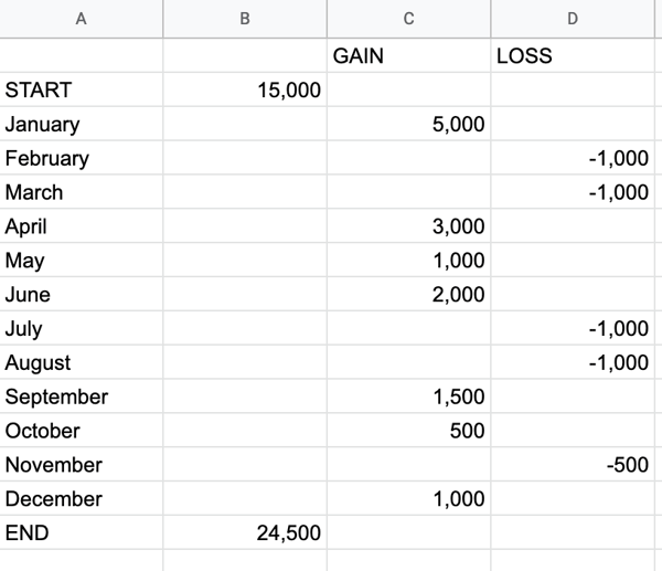
For instance, let's say you're tracking blog traffic from month to month. On the far left, you'll have the total traffic from the previous year. Then, you'll include the gains and losses month over month for the entire year. At the end of the chart, you'll see the total traffic for the year.
Here's what that looks like:
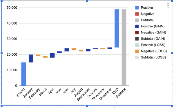
Essentially, a waterfall chart is supposed to show you where you started and where you ended up, with details of how you got there.
In the example above, you can see which months gained the most traffic compared to the months that lost traffic. This could help you see seasonal adjustments, while also keeping the big picture in mind.
Now, you might be wondering, "That chart looks difficult to make. How can I make my own in Excel?" Below, we'll review the simple three-step process to creating your own waterfall chart:
1. Create a table.
Before you can build a chart in excel, you'll want to create a table of values that you want represented on your chart.
For example, are you tracking blog traffic numbers? Or perhaps you're looking at leads generated from a certain marketing campaign? Either way, before you can create a waterfall chart, you'll need to gather your data.
All you have to do is open Excel or Google Sheets, and begin manually entering your data. When you enter your data, make sure you denote the difference between positive and negative values. To denote a negative value, just add a minus sign in front of the number.
In the example below, we decided to track blog traffic. Note: all numbers are arbitrary and not reflective of traffic to any blog.
2. Insert chart.
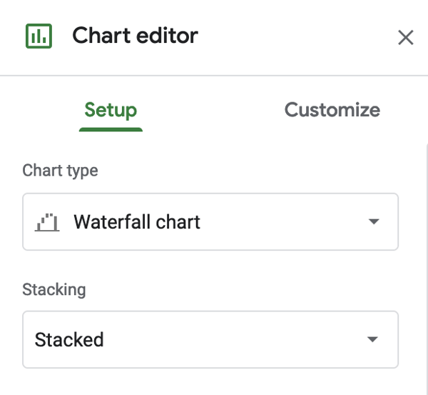
Now that you have your values, highlight the table you just created. Then, go to Insert → Chart → Waterfall chart.
This should create a waterfall chart and the Chart Editor will show up on the right-hand side. When the Chart Editor comes up, make sure that Waterfall Chart is selected under Chart Type.
3. Format waterfall chart.
At this point, all the hard work is done. All you have to do is format your chart and make sure it looks how you want.
If you click on the three dots in the upper right-hand corner of the chart and hit Edit Chart, you'll get to the Chart Editor.
Here, you can choose the colors of your bars, adjust your legend, or add gridlines. Most likely, the main thing you'll want to do here is to adjust your legend.
Now, you can also create a waterfall chart in other dashboard tools. For example, HubSpot offers free marketing reporting tools that you can use to create charts. Here's how:
How to Create Waterfall Charts in HubSpot
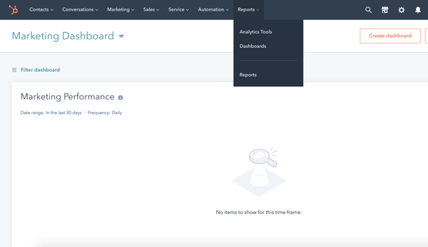
1. Go to analytics tools.
Once you log in to your portal, hover over the Reports tab and click into the Analytics Tools.
2. Choose what you want to track.
Next, you'll choose what you want to track. Perhaps you want to analyze blog traffic like we did in the example above. Or maybe you want to review analytics for a certain campaign.
Either way, you can choose what you want to track in the Analytics Tools.
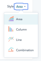
3. Choose the chart type.
Lastly, all you have to do is choose the style chart you want. Right now, you can choose between an Area chart, Column chart, Line chart, or a Combination chart.
To ensure you're analyzing the full scope of your analytics, we recommend creating a waterfall chart. It's a worthwhile data visualization that can help you understand your analytics sequentially.
Editor's Note: This post was originally published in May 2011 and has been updated for freshness, accuracy, and comprehensiveness.